
Early Reading
Early Reading
Pink, Blue and Green Series Reading Material
The large format word cards should be 4-5 inches high with a corresponding length. Importantly, the font must remain the same size for the cards, making the cards longer for longer words.
Because Dr. Montessori specifically stated that the sandpaper letter cards should be pale pink and pale blue, never gaudy or bright, we adhere to her color instructions for these cards. According to my mother, Dr. Montessori only added such details when she was quite serious about something as she was not given to idle chatter. The stories say that Dr. Montessori held her equipment makers to high standards, insisting that they re-make material over and over until it was perfect.
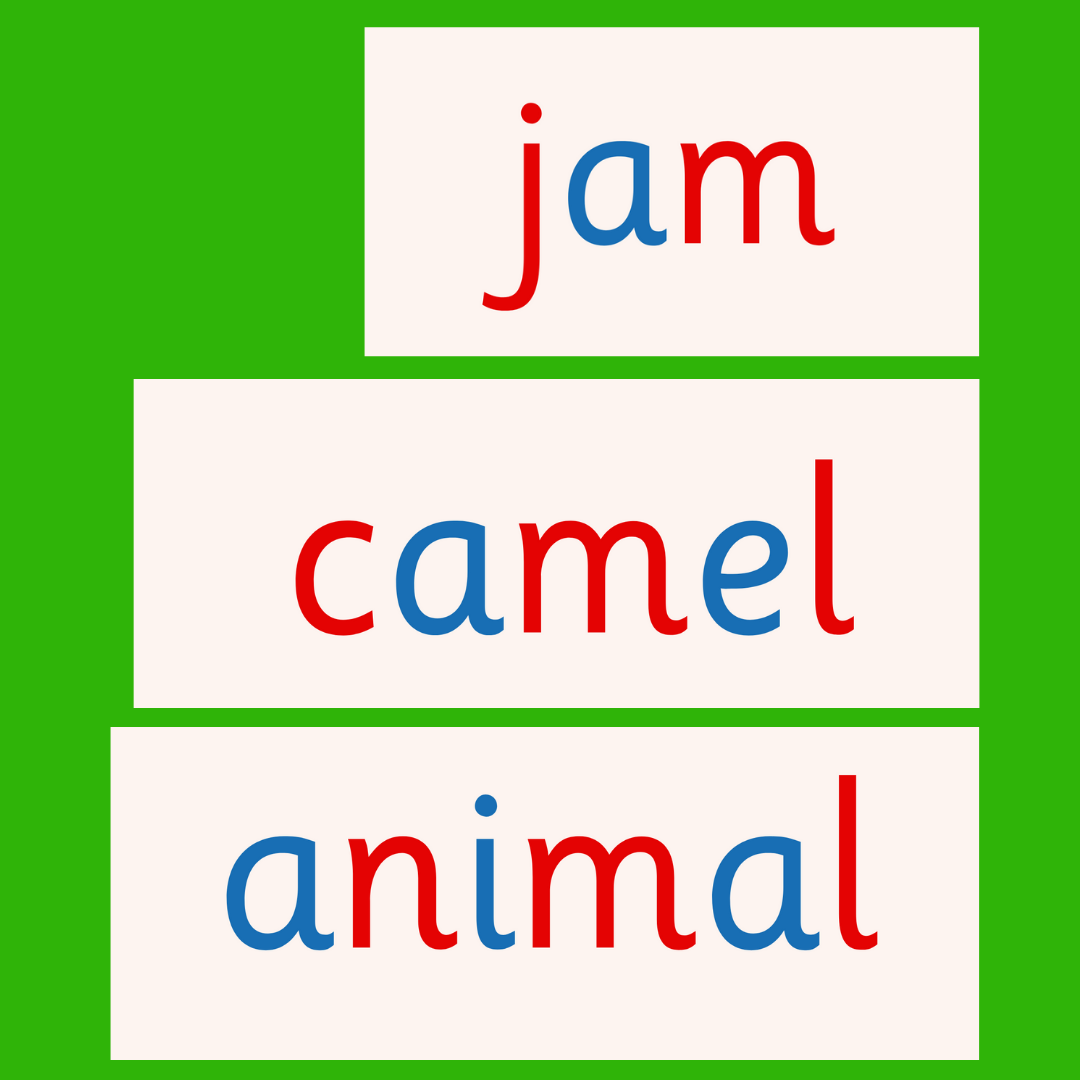
This is what the different sizes look like against the medium green mat, the color of which she also specified. I trimmed the ends of the mat off, so you could see the cards better.
I cannot remember when AMI instruction started to use Pink, Blue, and Green Series to help categorize the reading material, but I think it was sometime between 1950 and 1970.
Initially, we did not use these terms in our table of contents, merely making mention of the categories in the teaching text. Belatedly, I realized that the color labels would help parents know what to buy. Actually, when we digitized our hand-written and typed material, we forgot that people wouldn’t be making the reading work by hand because all of our material was initially written by hand (color printing used to be extremely pricey).
And then I looked online to make sure parents could buy the materials at affordable prices, but I discovered that many sellers had created the sets with incorrect material, the wrong format, or completely erroneous exercises. (I have a semi-rant on this material in an earlier post.)
Later, parents told me that they were paying to have PDF material printed, and the printing was pretty expensive, especially for the heavier cardstock we like best.
This is how our Pink, Blue, and Green Series work was reborn! We include the little books that go with each level because these are key to reading progress. Now they are going on our Etsy shop in digital format, but we will make a printed bundle available soon.
Anyhow, if you have our earlier versions without color labels in the table of contents, the details are in the text, but the simple short vowel words are all pink, the blends of consonants are blue, and the long/alternate vowel combinations are green. Some children do not find the blue and green levels to be much different in terms of difficulty.
Remember that if your child asks about a certain word, you can teach that word. It does not matter what level or color it is. Just keep the explanation short. Your child does not need to learn it now, they just need to feel that they can get a good, crisp explanation to a question.
You can tell your child that you are just learning how to teach, so you will try to make a good explanation — “You can let me know if it is a good explanation.” You can even tell them at another time that you thought of a better way to explain it.
Right now, it is good to review all the vocabulary in the levels by yourself. Consciously integrate these words naturally into conversation. It takes a bit of adjustment to talk with a small child this way, but it is an amazingly rewarding habit.
Reviewing the vocabulary will also help you understand why we introduce certain words in different categories. As the differences become clear, you will see why we avoid certain types of words in material and books that young children read themselves.
When you choose books to read aloud to your child, the writing must be gloriously descriptive and euphonious!
I like how this is practically described and helps teach the parents. Unless we grew up in a really large extended family many of us did not get much experience teaching those much younger than ourselves. And I think many parents think they have to be perfect all the time. This post both models the desired behavior and recommends it. Very good.